The Brief
KIT needed a new website to match their colorful identity, but without overpowering their great content.
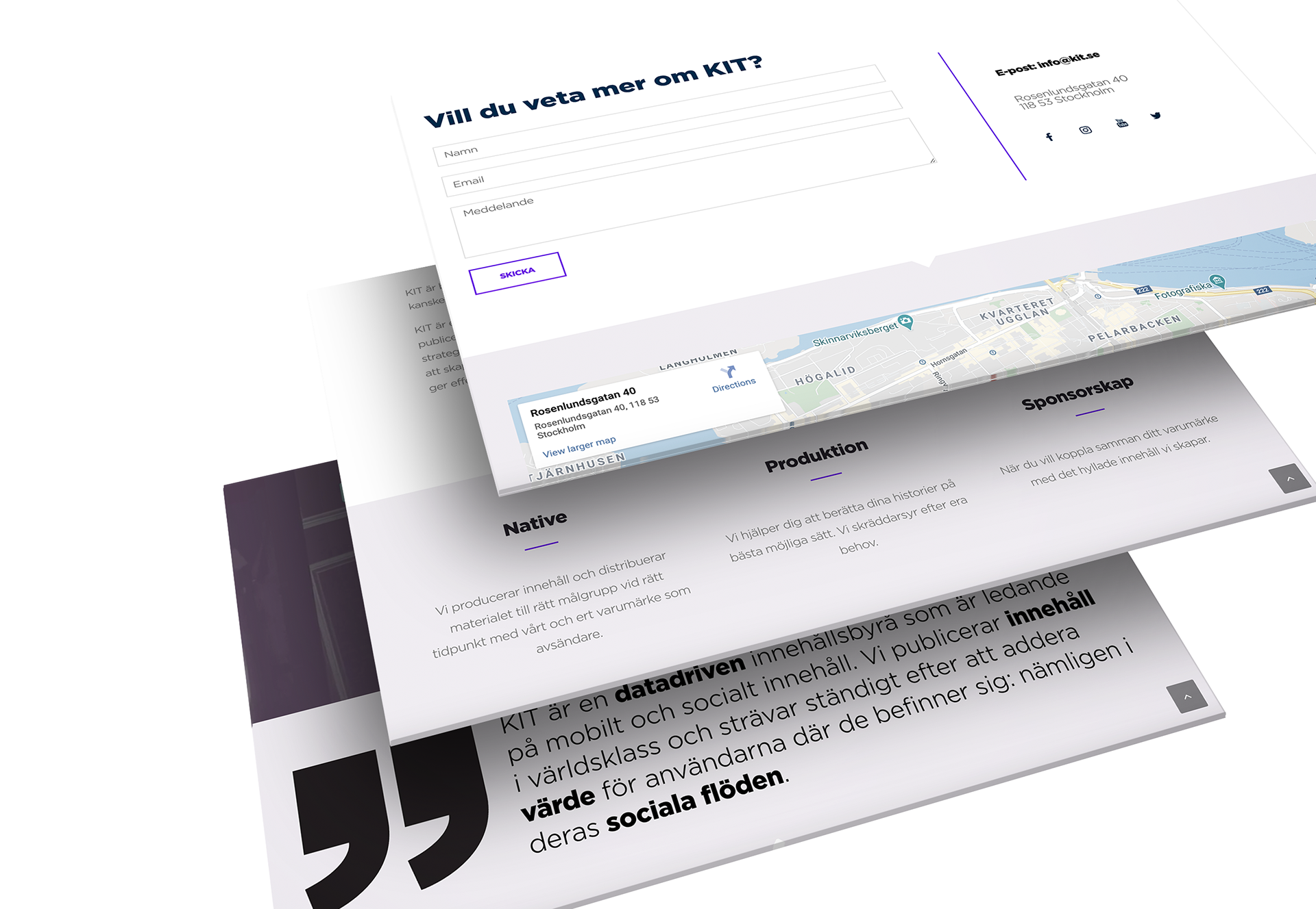
The Solution
I decided that the bold typography would be the main feature in the design. I also chose to use the iconic KIT purple only as a highlighting color and their seafoam green as the main color on the site. A playful, slightly "off grid" look gave the website a modern finish.
The Process
First I went for a design that was even more playful, but then we decided that actually overpowered the content too much. The first design also had the rare problem of ending up with too much white space. So I went back to the drawing board and designed a more compact version that could present the content in a better and more versatile way. In the end a much better solution that still suited their bold brand identity.