The Brief
Design a clever solution for the real estate business. Include features like search, compare objects, chat with the realtor, create a budget and reminders for house showings.
The Idea
My original idea to keep it real simple was to create a web app, but as features was added on and the brief changed into a much more complex project, I started sketching on a native app. The idea was to keep everything you need when browsing for a new home in the same place. An app that is your partner in crime when buying real estate. It's your reminding friend, your trusted economy advisor and your attentive inspector.
My role Product designer
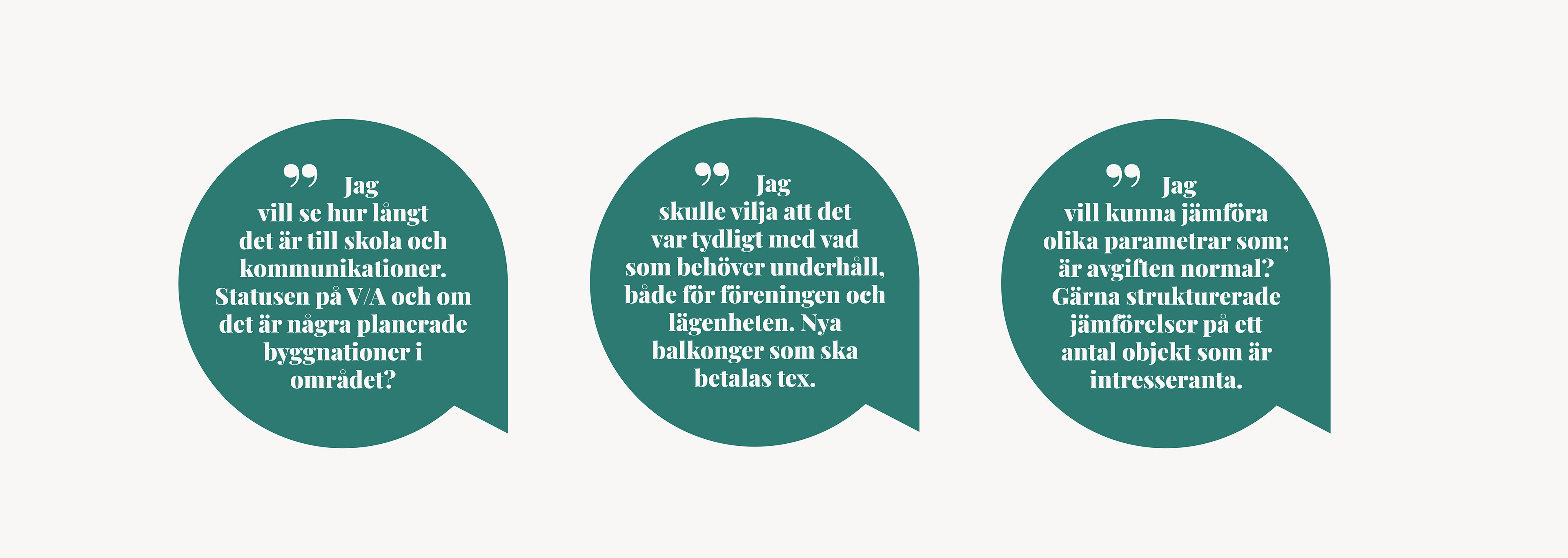
Research
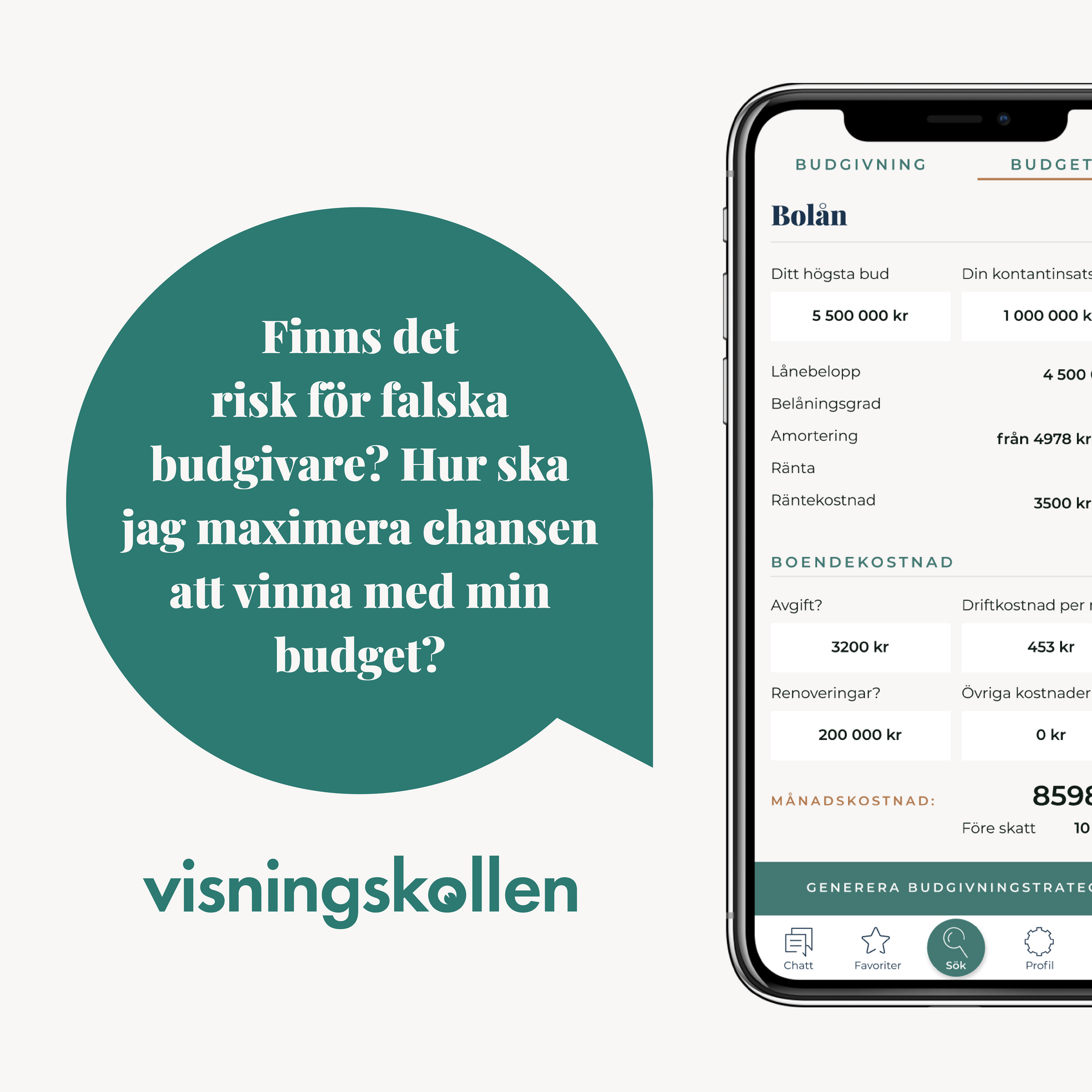
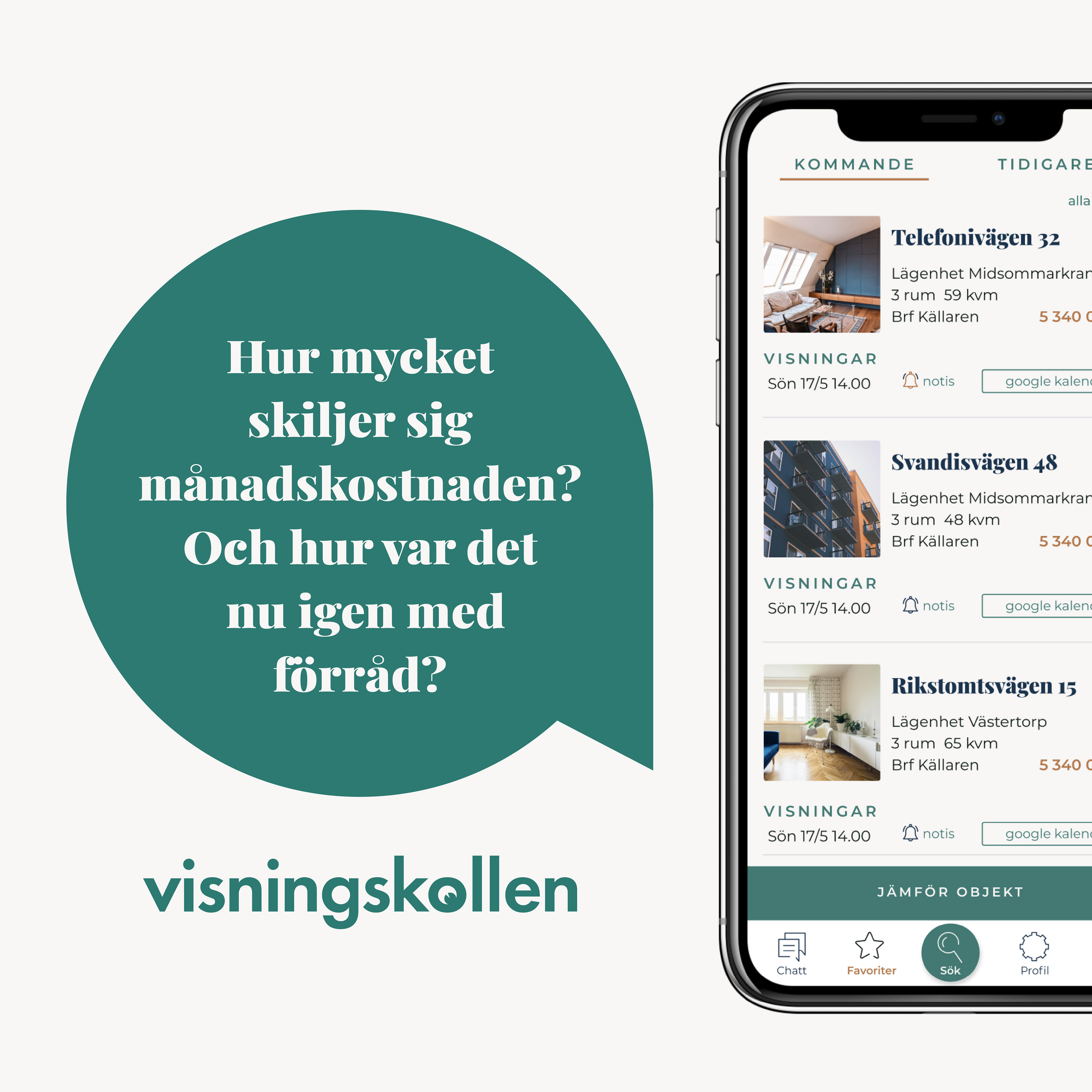
I got to dive in to loads of facts and technical documentation that was already compiled by a team before I got into the project. What I could contribute with at this stage regarding research was the users point of view. So I set up a few interviews with users that either was in the market for a new home right now or recently had been. I wanted to hear about the obstacles they have run in into and their thoughts about the tools that are available today. I asked them what they thought the tools were lacking and what their dream feature would be. Below is a selection of key quotes from the interviews.
Define & ideate
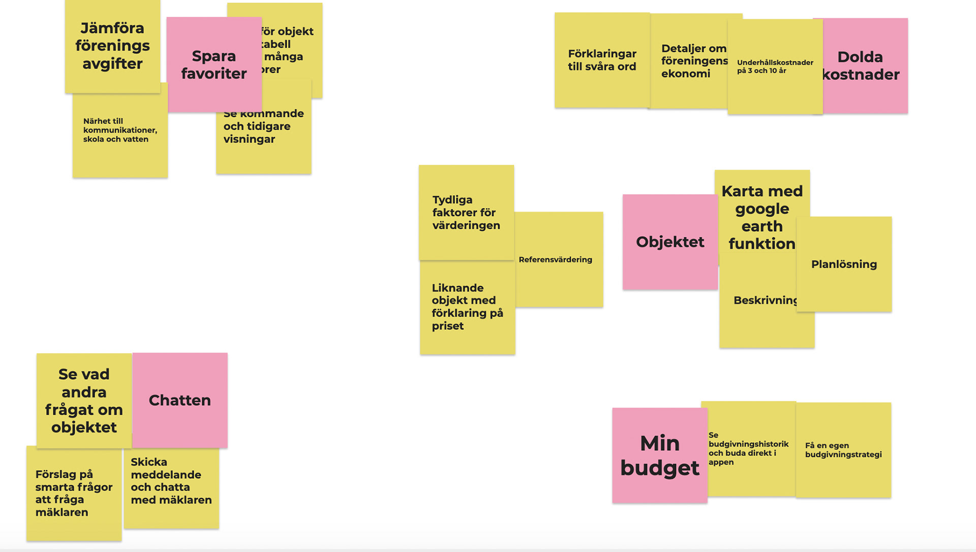
I started out as usual with loads of post its, combining the facts and features that was already research by the team before me and added the insights that I had gotten from my own research. Then together with the team sorting them on an impact/effort map to be able to discard some of the possible features that would be too difficult to develop for what the result was worth. The remaining post its was then sorted to what would become menu tabs and sub pages within the app.
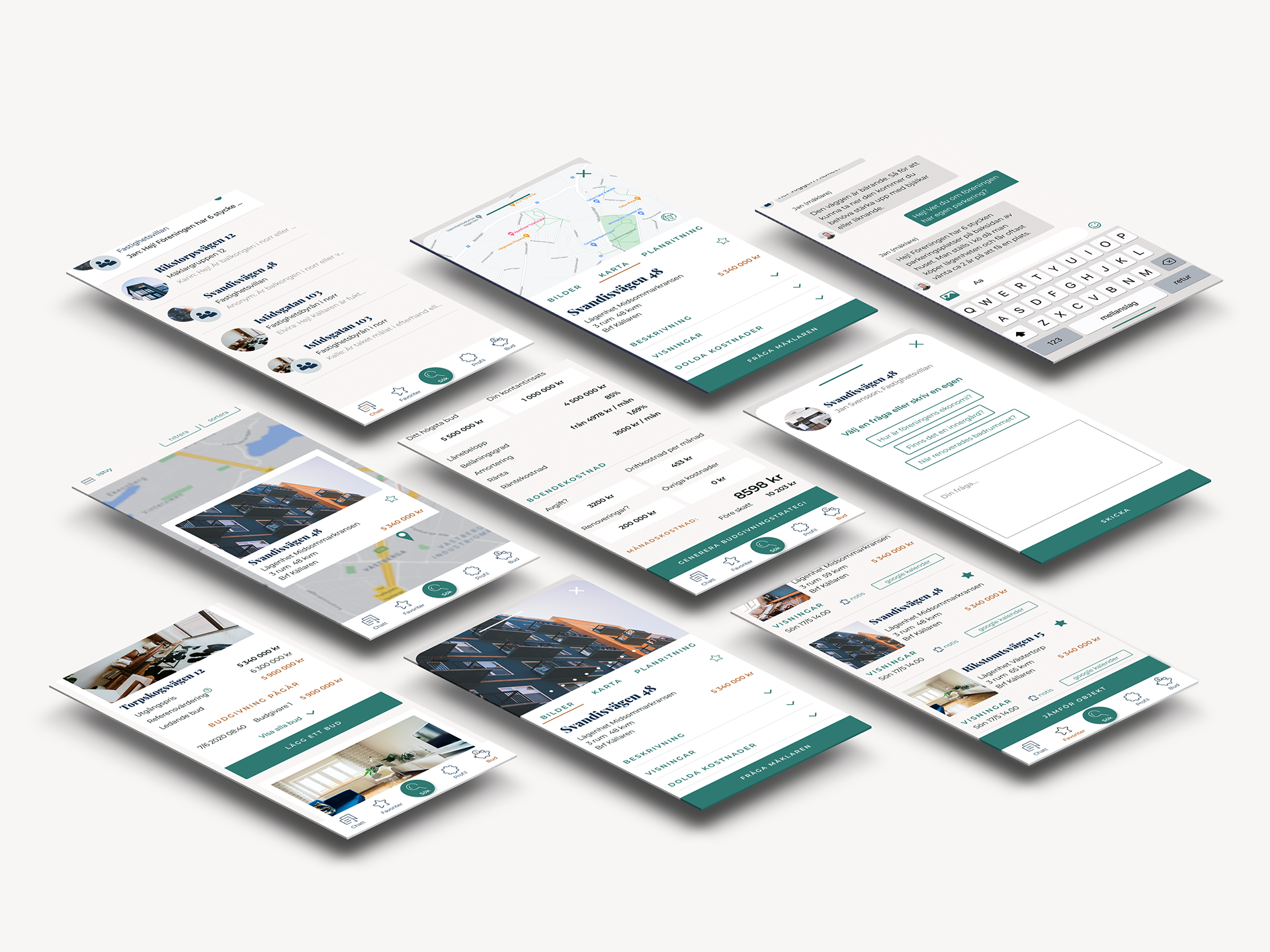
Wireframes & prototypes
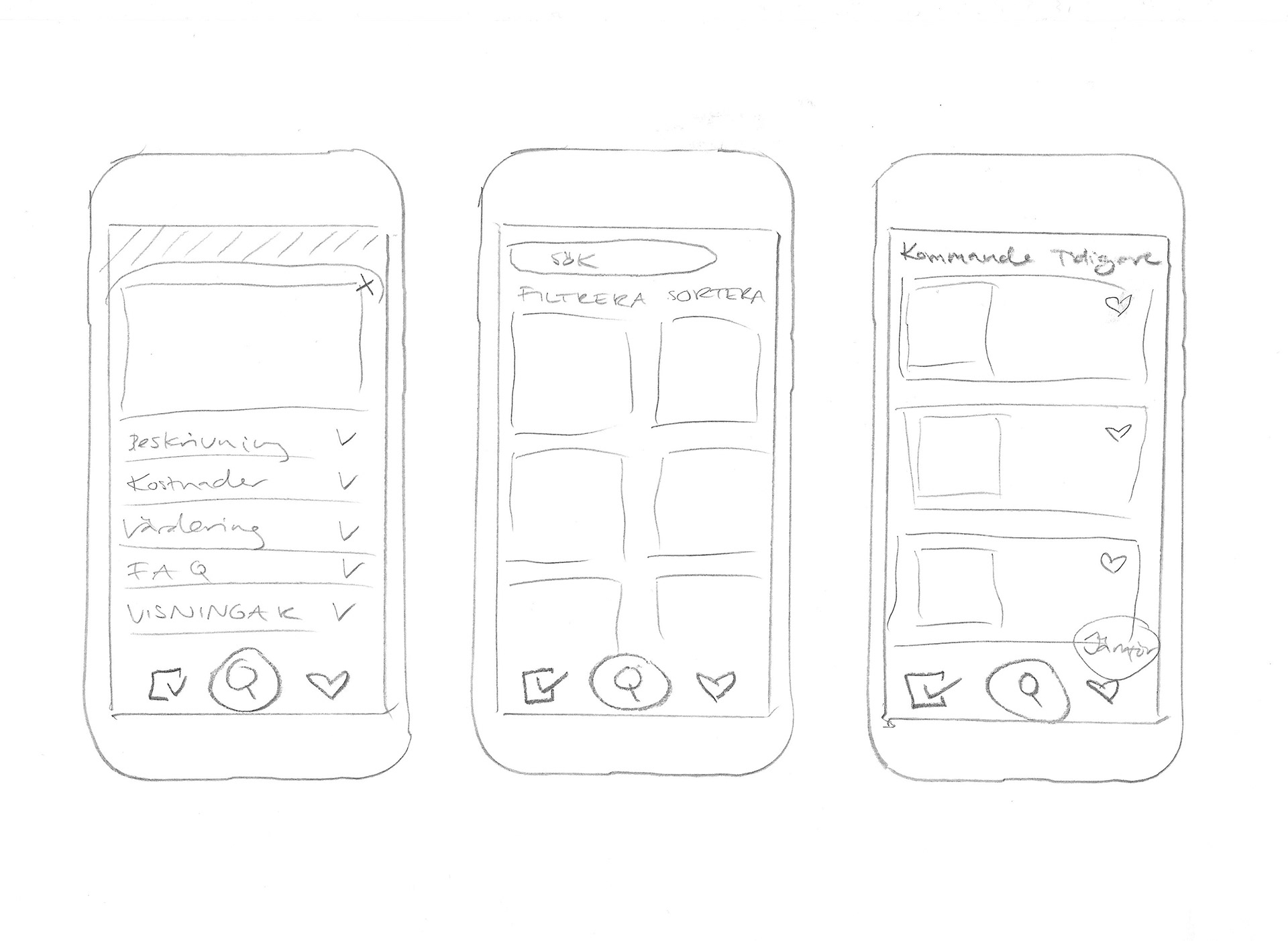
I love to draw quick and dirty wireframes on paper just to see how my initial ideas turn out. That way I can do 10 different designs in 10 min instead of 1. When I was somewhat satisfied with my drawings I headed on to Figma to try out the designs in a hi-fi prototype. The design of the app has evolved and changed many times and is still under work. Getting it as finished looking as possible to be able to do a smoke test on social media to see if there is any real interest in the app. If the is, there will be more test and more ideation after that.

Ads & landing page
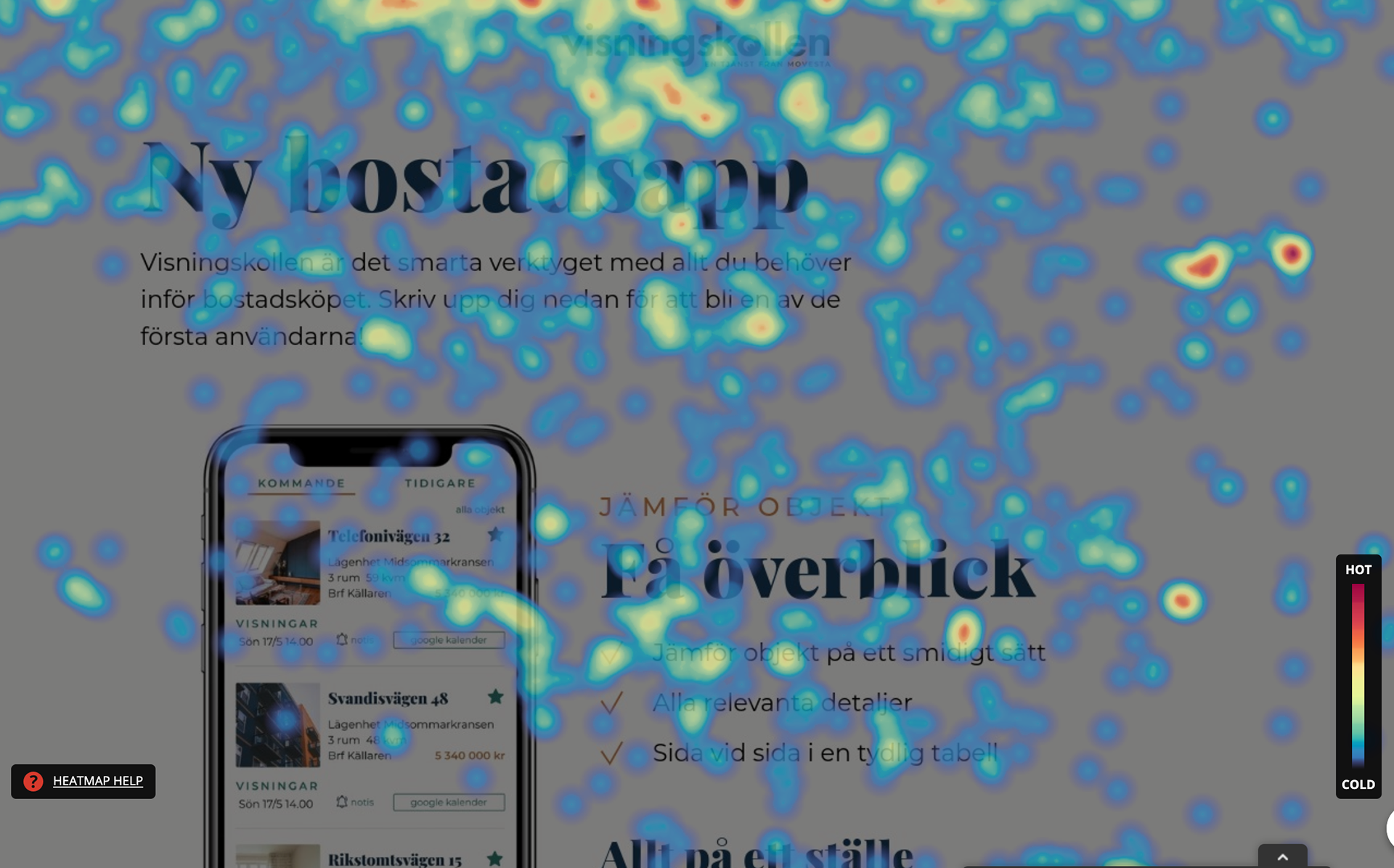
To be able to do the smoke test we did some ads to go on social media and a very simple landing page with a sign up form. After looking at some heat maps and screen recordings we changed the landing page by removing the first section and making the sign up box more visible by changing the color from white to dark blue and adding one more at the bottom.